Beyond Aesthetics: How Visual Identity and Grid Precision Elevate High-End Brand
Introduction In high-end manufacturing and design, true sophistication is never just about visual appeal—it is a deep expression and continuation of a brand’s core spirit. Transforming abstract brand philosophy into tangible visual symbols requires a balance of quiet elegance, strict typographic hierarchy, and meticulous layout discipline.
01. Defining the Brand Aesthetic Baseline
-
Core Style Positioning: Establishing a clear, foundational style injecting a distinct “soul” into the visual system. It sets the baseline for how a brand communicates its quality and craftsmanship.
-
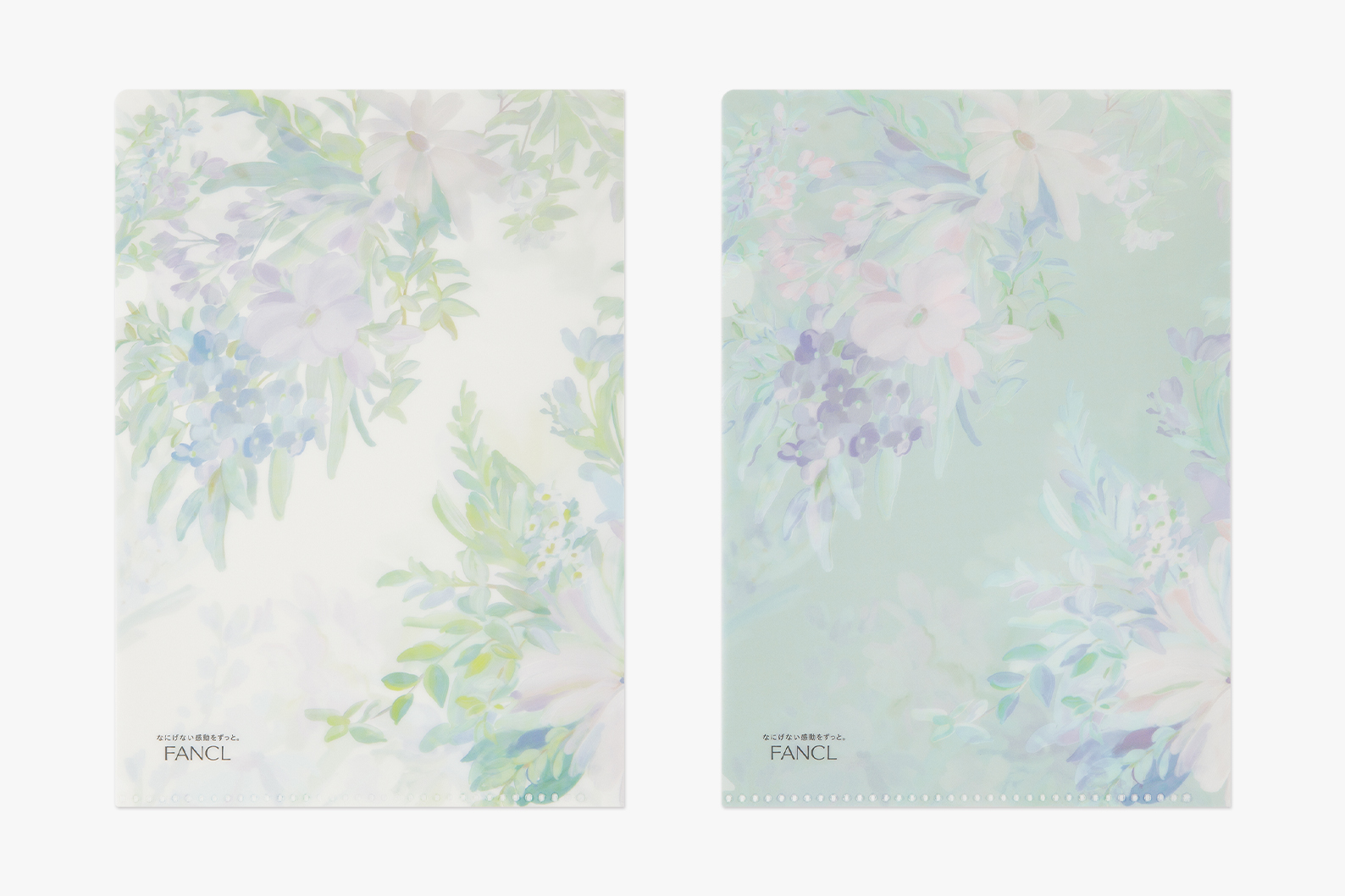
Color Reconstruction: Moving away from high-saturation visual noise. We advocate for low-saturation, harmonious color palettes that evoke understated luxury, calm focus, and timeless craft.
-
Literary Narrative: Infusing a subtle literary touch. Every product and visual layout should carry a storytelling nuance that aligns with the brand’s heritage and purpose.
02. Systematic Application of Visual Elements
-
Layout Order: Implementing minimal layout structures paired with precise grid systems. This ensures functional clarity while elevating the overall aesthetic rhythm.
-
Typographic Standards: Rigorously defining font weights, line spacing, kerning, and hierarchy. Strict typographic consistency strengthens brand recognition and creates memorable visual anchors across all touchpoints.